

This project centers around K-12 school districts in the United States, aiming to alleviate the burden of managing digital whiteboards by redesigning a streamlined device management system (DMS) tailored specifically for the education sector.
Timeline
1 year
2022 - 2023
Feature Team
2 UX Designers
2 UI Designers
1 PM
A team of 13 engineers
My Role
UX Designer, focusing on User research, Feature planning, Interface and Interaction design, Project & Product management, and Design Ops.
Due to the pandemic, industries have been accelerating their digital transformation. Similarly, schools are embracing technology in their teaching practices. However, managing a large number of technological devices poses a significant challenge for school IT departments.
BenQ's education solution offers BenQ Board and DMS. BenQ Board is a digital interactive whiteboard that enables teachers and students to use interactive materials and applications during the class. Meanwhile, IT administrators can install, configure, and maintain the digital whiteboards through the cloud-based platform, DMS.
Before conducting research in the U.S., we tried to familiarize ourselves with the organizational structure of American schools.

Schools in the U.S. are managed in districts, which, unlike Taiwan, resembles large corporations in scale. This, in turn, increases the complexity of device management.

With an increasing number of larger school districts among our clients, the current DMS often faces complaints regarding the time-consuming and labor-intensive task of maintaining devices in bulk. This leads to unpleasant experience where the BenQ Board becomes malfunctioned and negatively impacting classroom instructions.
And therefore to ensure the quality and security of teaching and learning in the classrooms.

We visited 6 schools to conduct contextual inquiries in Texas, USA. From the collected data, we synthesized and identified 3 main problems of the original version of DMS.
*These 6 schools are all our clients, they are selected base on their activity on our products. Due to some business concern, we don’t have full control of selecting the interview participants.
Modifying settings in the current DMS requires reselecting target devices each time, making the process time-consuming and error-prone. While the original design suits individual device-specific settings, IT administrators often prefer consistent settings district-wide, with minor adjustments for specific grades or schools.


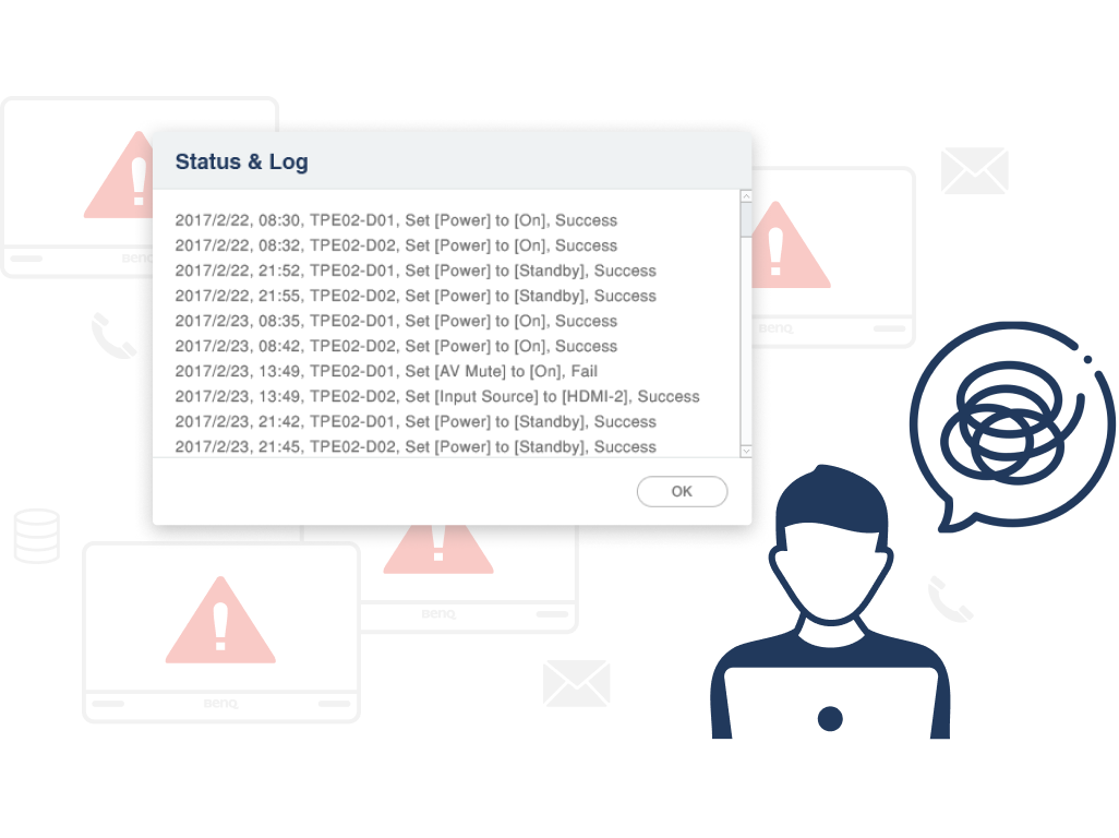
The original dashboard presents data by individual device, resulting in information overload and poor readability. As a result, hardly any schools exploit the dashboard. However, without that, IT administrators may lose track of malfunctioned device while monitoring a large number of devices.
Since teachers and students all have access to the board, it often leads to complex settings or security issues. When encountering abnormalities or receiving inquiries from teachers, it is critical to quickly identify and troubleshoot the problem. However, the current operation log information is difficult to read and utilize, and the channels for seeking assistance are unclear.
IT administrators have 2 key JTBD(Jobs to be Done) lying behind the pain points, which are, to reduce the chances of issues occurring and to enhance the efficiency of trouble-shooting. So we try to help them do their job in the following design strategies.

Integrate multiple settings into a bundle

Present data with better readability

Make operations easily traceable
To establish a solid foundation, we began by using a site map to communicate the structure and hierarchy of pages across teams.

Then, we quickly created wireframes to communicate our design concepts. Throughout this process, we encountered certain technical limitations and business considerations. In the following examples, we strived to make necessary trade-offs in design and mitigate the impact on user experience.

A glimpse of the wireframe. (Due to NDA, this image is blurred on purpose.)
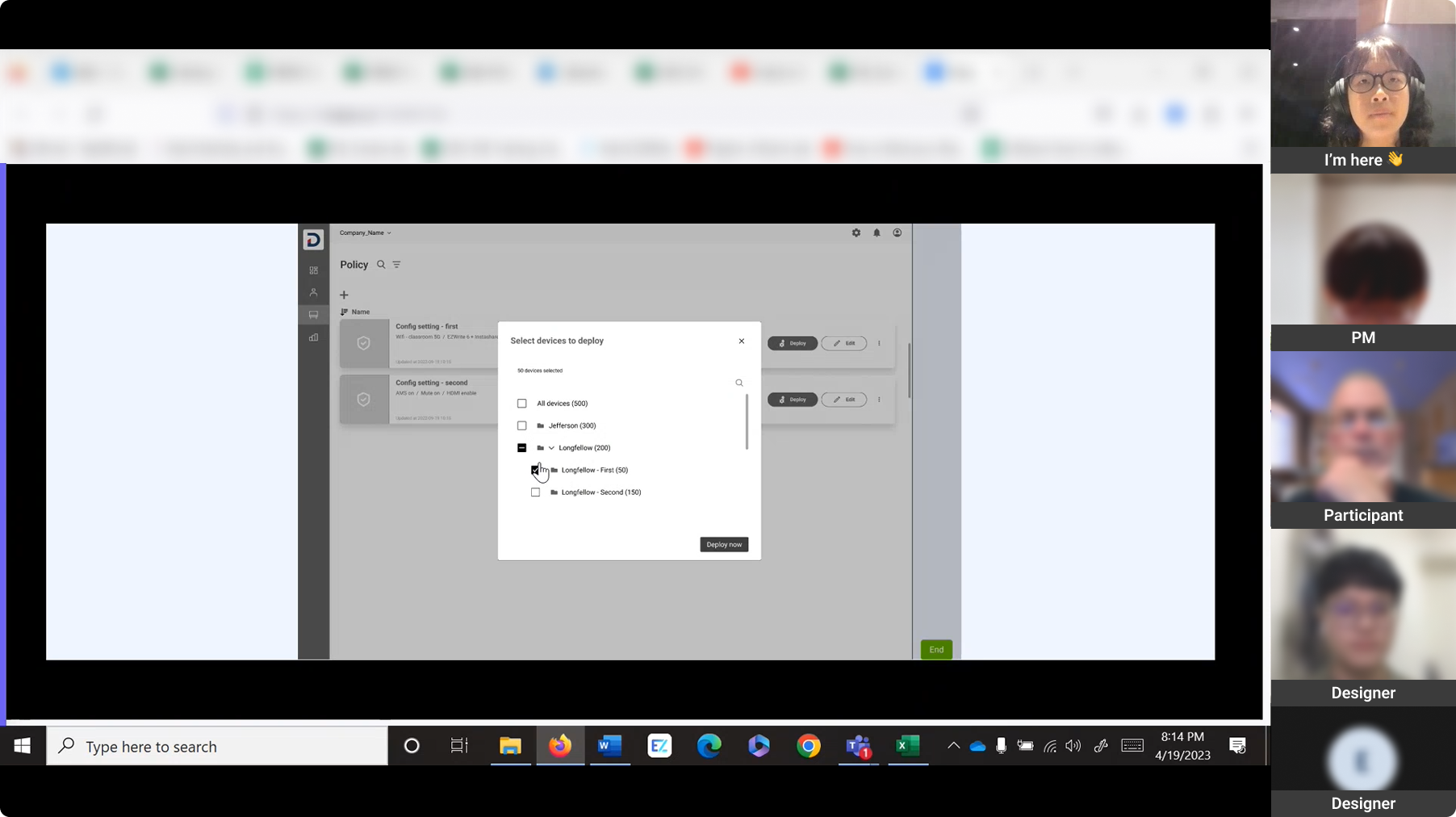
Initially, we wanted to show all settings on the policy editing page, allowing IT to adjust every settings all at once. However, considering that some settings may be adjusted by end-users, for example, teachers, to cater to their teaching needs, and IT managers often don’t want to mess that up. Additionally, we realized that deploying multiple settings to a large number of devices could be resource-intensive. Therefore, we apply the concept of “shopping” to policies. IT managers can add necessary items (settings) to the shopping cart (policy), focusing only on the settings they need to manage.
The "Dashboard Updates" section aims to provide real-time progress updates for operating events. However, due to variations in chip performance and network quality across devices, calculating overall progress percentage for numerous devices is challenging. Moreover, as events increases, it can overload the backend processing capacity. To address this, we decided to show only the number of devices in each status, which is still clear to understand, and add a "See More" button for users to load data on demand. Additionally, a dedicated page stores and presents all events that IT manager can check at anytime.
1. Introduce new feature - Policy, which bundle up settings. Applying settings to devices is just like attaching labels, allowing future modifications by simply editing the label contents, thereby configuring a large number of devices at once.

2. Group similar data charts in a card and replace bar graphs with donut charts, which are better suited for presenting big amount of data. Additionally, we still provide the access to individual device in the detail page, enabling users to adjust setting based on the information on dashboard.

3. Embed clear cues in the flow, guiding users to track device status and log. Therefore create a seamless experience that enable IT mangers to identify and troubleshoot issues in a timely manner.

Due to limited timeframe, we only focused on validating assumptions about key user experiences. We recruited internal staff members, FAEs (Field Application Engineers) for testing as they have experience in school device management.

We conducted remote interviews using Maze, participants can review task instruction when they need.
We can clearly see how our participants interact with the prototype.
"Applying multiple settings at once makes management easier, however, the diversity of use scenarios should be taken into account"
As an interviewer, I carefully observed participants' behavior while they perform each task and asked follow-up questions afterwards to learn the "why". Here are our main findings:
1. Compared to previous experiences with the DMS, FAEs preferred the new approach of applying multiple settings at once through Policy. It helped prevent omissions and errors and it is easy to learn.
2. The way IT staff use the new feature, Policy, is based on whether the settings require constant updates and whether the settings are consistent across the entire district. This influences the mechanism designed for Policy.


3. Since a larger number of settings are applied at once, it is important for them to know how the settings are going to change. However, participants don’t seem to understand the mechanism of applying policies more than one time to the devices. For example, is the policy applied later going to “override” or to “add on” the original one?
Based on the test results, we proposed an optimized design plan and engaged engineers in early discussions. We have considered the compatibility between current practices and future improvement directions, as well as provided strong evidence for future designs. We decided to divide settings into 2 types. One includes settings which only IT administrators have access to and are mostly unchanged, the other consists of settings that require periodic updates and may be adjusted based on classroom needs.

Both of them are used in different scenarios that map closer to the real world. Moreover, we clarified the relationship between the devices and the 2 types of settings, making it easier to understand how it works when adjusting multiple times.


◆◆◆
We built our company’s first ever web design system while working on this project! It is after rounds of persuasion and discussion that we finally convinced the company to allocate resources for building a design system. This has instilled in us a greater confidence in the future design consistency.
Also, I led the first design critique, inspired by Figma, in the design team! It was such an exciting experience to have designers from different projects share their ideas from various perspectives.

None of the team members had previous experience working with each other, so I gathered the entire team to discuss about how we can collaborate more effectively. Transitioning from PDF documents to real-time, online tool, Figma posed many challenges for engineers, but we successfully established the norm.

I have consistently strived for continuous design iteration. To facilitate this, I established a comprehensive backlog list for the design team, enabling us to track and prioritize projects within the constraints of time. Looking ahead, my vision extends beyond design team—I aspire to create a collaborative environment where cross-functional teams can leverage the power of shared tools and processes while driving impactful design outcomes.

When developing B2B products, it's common for product managers to receive requests for additional features based on the needs of certain "big" clients or the presence of similar features in competitors' products. While considering the business interests is inevitable, it is equally important not to let these changes impact the overall product experience. Therefore, it is crucial to learn about user needs behind these feature requests, and prioritize them.
A delightful user experience not only requires user-friendly interaction but also the smooth and accurate presentation of a vast amount of information. Through this project, I have learned that this relies on close communication with engineers during the early stages of the project, establishing a consensus on the priority of information. Only then can we ensure that the architecture behind programming and interface design are align so as to create an optimal experience.