
This project is aimed at building a more user-friendly LMS(Learning Management System) for both instructors and learners, so that they can easily leverage technology to achieve academic success together.
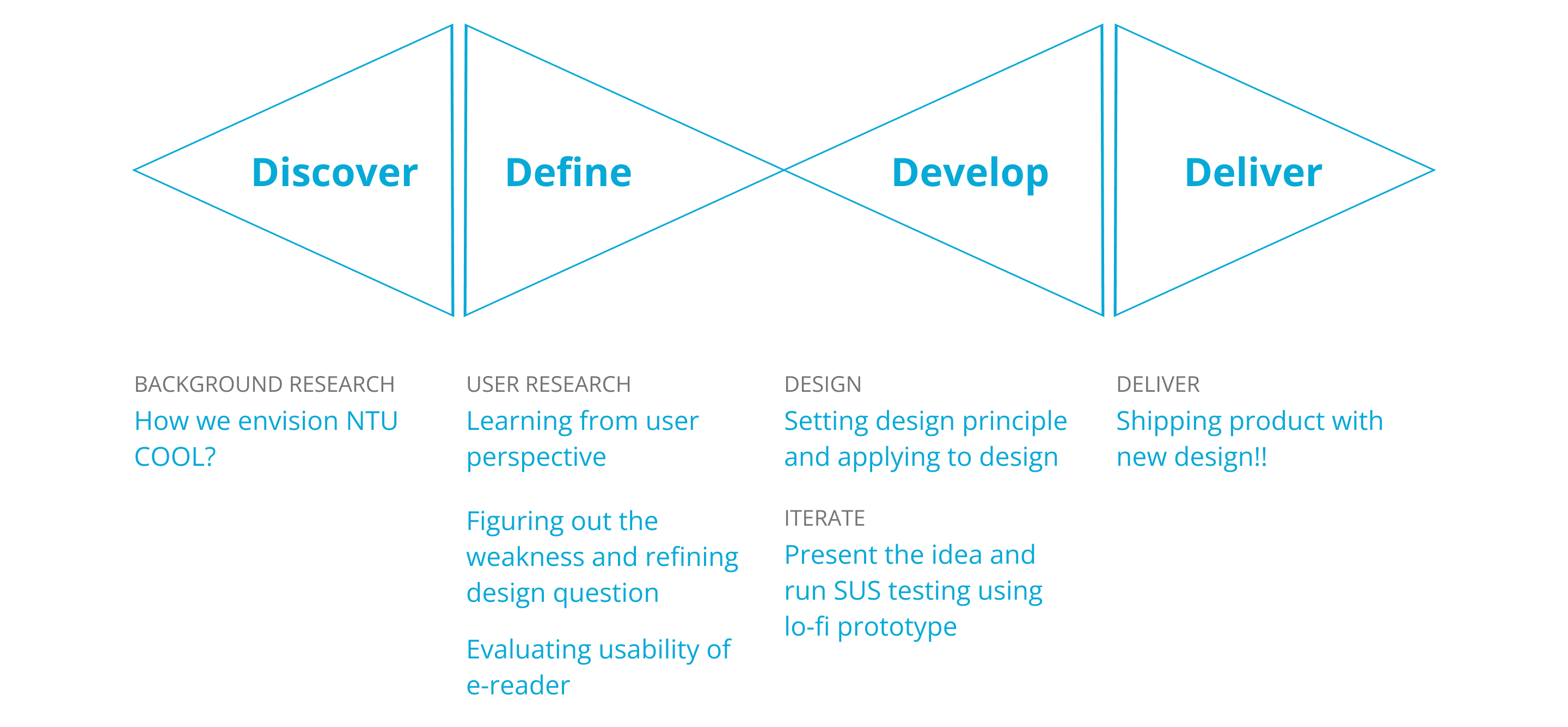
Deliverables: personas & mid-fi prototype
Outcome: As COOL becomes more mature, the number of courses on the platform had grown by 90% from 2019 to 2021, and is ready to replace the old platform in 2022.
Timeline
2 months
2019
Feature Team
1 Designer
2 Engineers
My Role
UX Designer, focusing on Interviews, Thematic analysis, Heuristic evaluation, Usability test
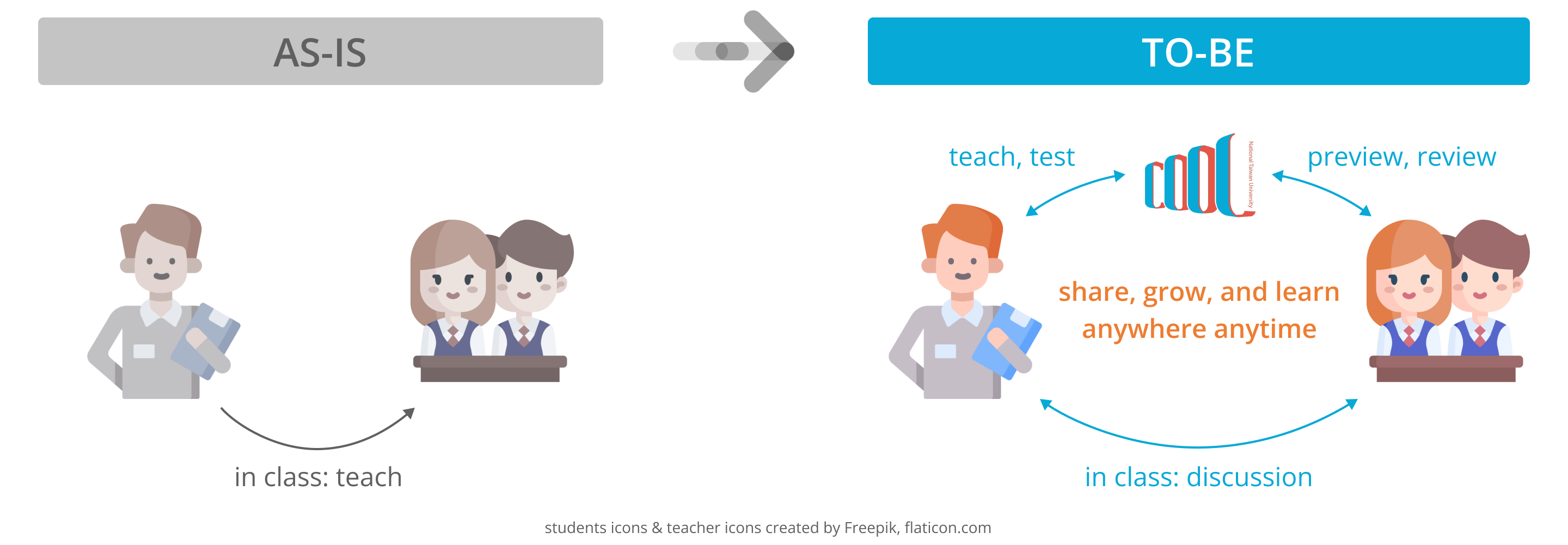
As new educational trends evolves, learning is expected to happen anywhere at anytime and that learners can thrive in any possible way. Therefore, COOL, a new LMS(Learning Management System), is born with an ultimate goal to lay the foundation for interactive learning environment and support innovative educational activities at top 1 university in Taiwan, NTU. However, instructors and students were more used to the original platform, CEIBA, at that time and there was a lot of voice saying nonintuitive interface on COOL has been a barrier to use. Since we had limited resources(time, money, and peronnel), our design question was: How might we improve the key aspect of overall experience and make COOL a helpful platform to instructors and learners?
Before talking to users, the whole team discuss with each other to make sure we have the same vision, that is,
“To empower every instructors and learners to share, grow and learn in their own way.”
Under this vision, our objective includes but was not limited to
Then we went to users for their opinion.
Obviously, both students and instructors are important stakeholders to LMS, however, instructors play the key role to choose which platform to use and to plan courses most of the time. Moreover, since COOL was at an early phase of product development, there were not many users then, so giving those few “early adopters” good experience is our first priority.* Therefore, due to limited timeframe, we focused on learning from instructors who have used COOL before in this research.
We conducted 12 interviews with university professors from 6 different departments to see how they are using COOL and how COOL affects their teaching. After analyzing the data, we created a persona to make sure we keep our user in mind while designing the product.
*There is another team responsible for promoting NTU COOL, which is not included in this project scope.
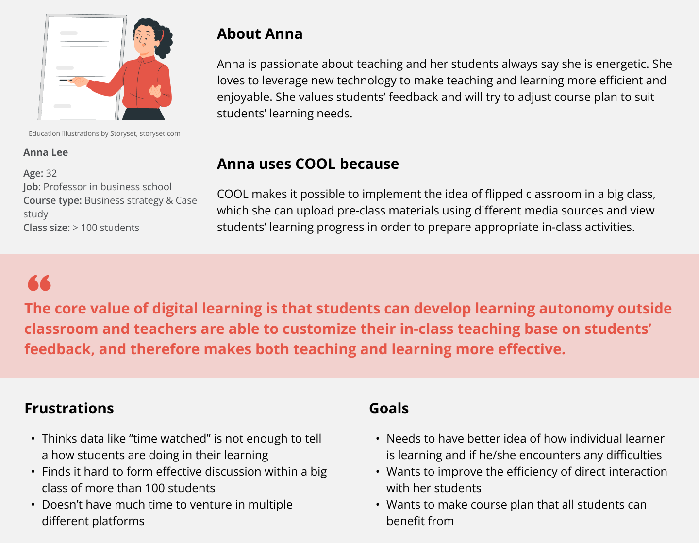
To sum it up, Anna is happy with being able to upload all kinds of class materials on COOL for students to preview before class. It is also helpful for her to use the data COOL collect to see how students interact with the materials. However, she needs more insights of what students are thinking and if they have any questions, unfortunately, it’s hard to have conversation with individuals during big classes.
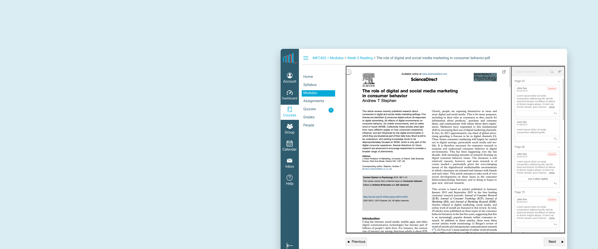
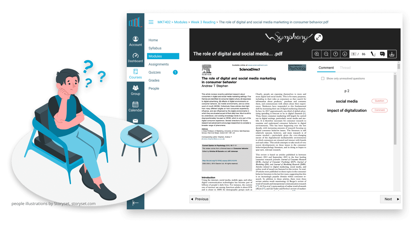
Comparing the goal of ours and of target users, the gap is how we think COOL can do on affecting two-way interaction. There we had a refined design question, “How might we make interaction between instructors and learners outside classroom easier and more effective on COOL?” We then decided to work on improving 2 main features, video platform and e-reader. I was responsible for the e-reader at that time.
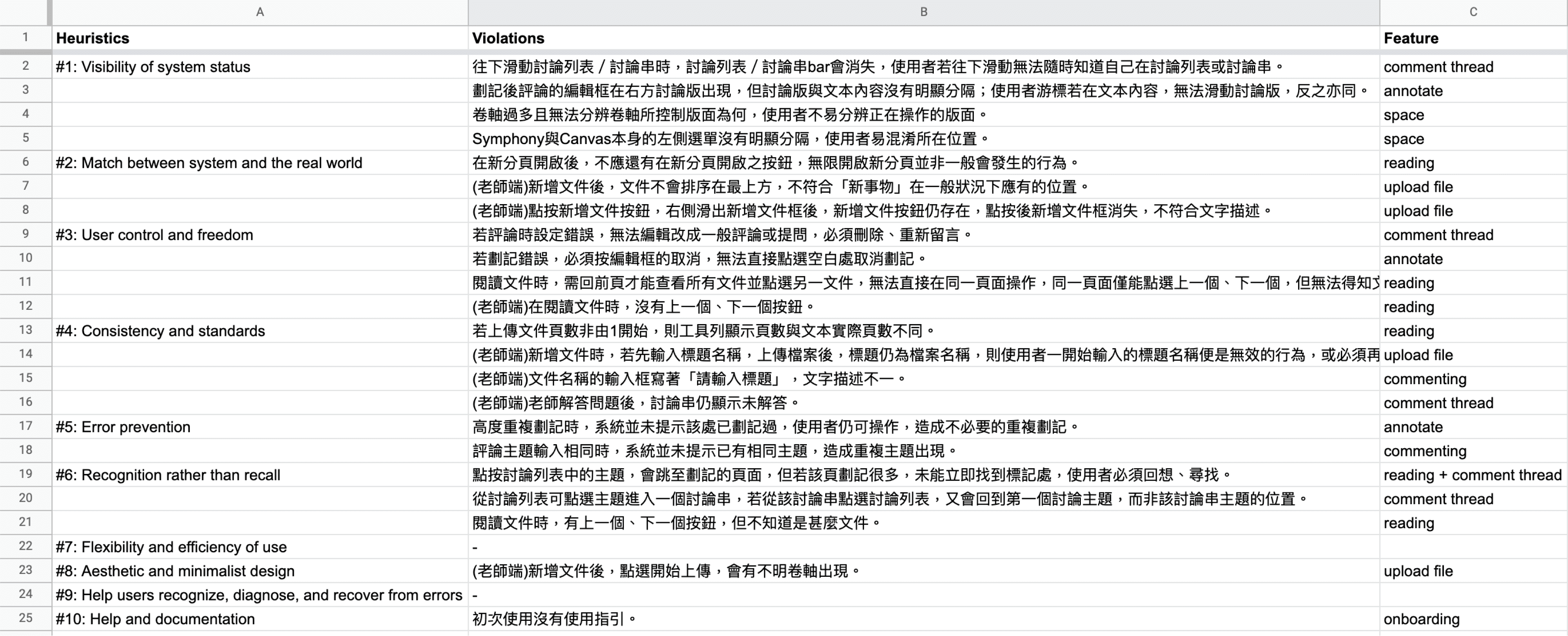
To identify current usability problem of e-reader, I did a heuristic evaluation by myself. Most severe violations are in the following 3 areas, “Visibility of system status”, “User control and freedom”, and “Error prevention”.
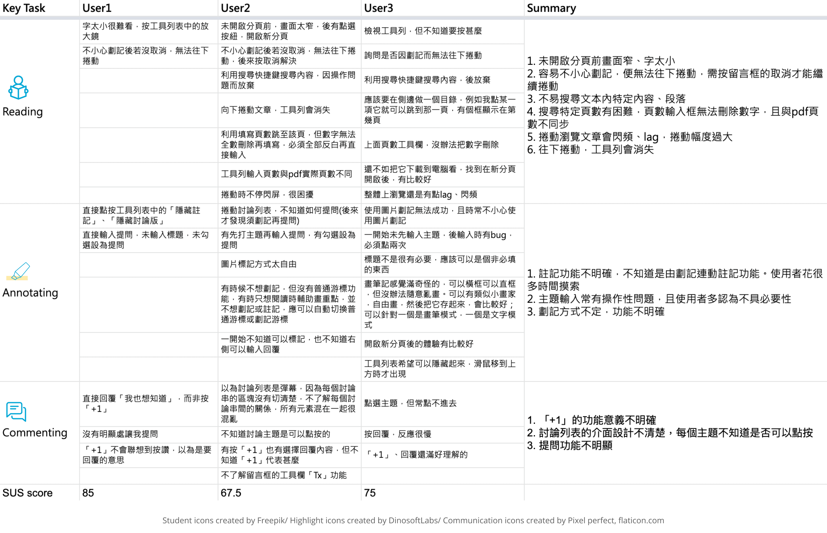
I also conducted three sessions of usability test with university students*. During the test, I assigned my testees three main tasks, which are designed to observe their reading, annotating, and commenting behavior, and ask them to think aloud while interacting with the interface. After they complete all tasks, I had them fill up SUS survey and asked follow-up questions to get more insights.
*While this project was during summer vacation, professor was hard to reach, therefore I recruited students for usability test and we planned to invite professors for future version.
Consulting the result of both heuristic evaluation and usability test comprehensively, I came up with the action plan below.
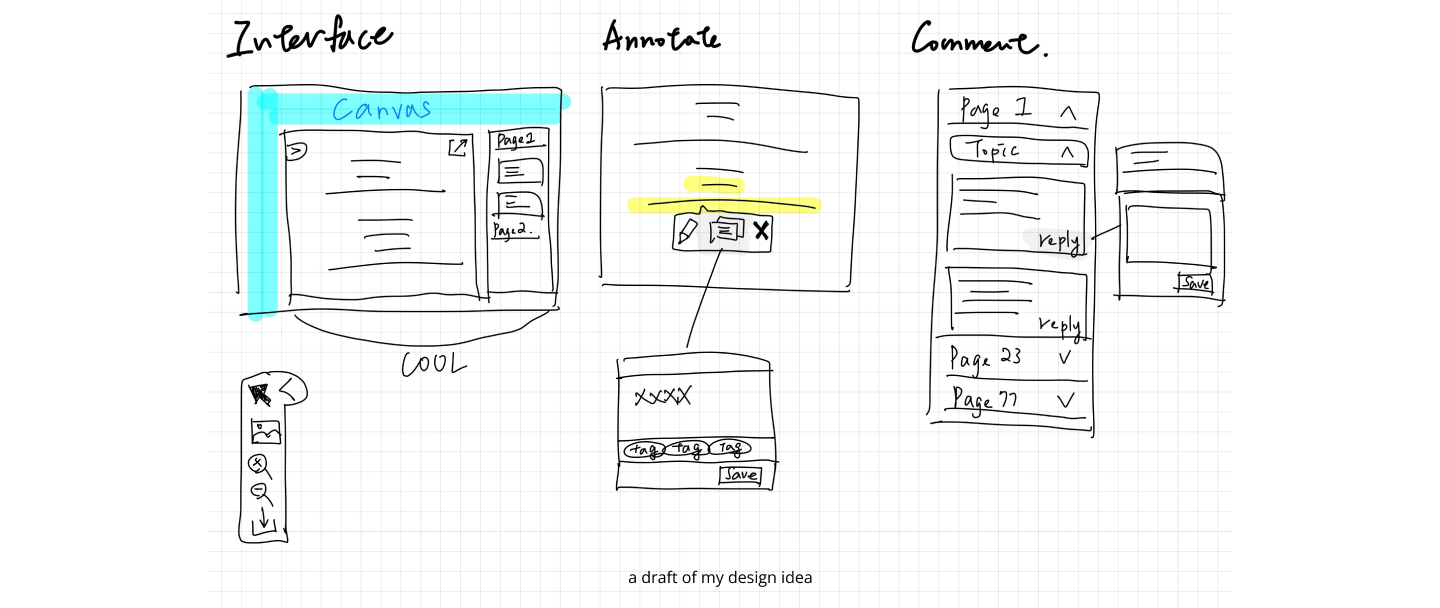
First, the area of content should be clean and suitable for reading, then it is more possible to keep students to stay on COOL to read paper and leave comment. Second, the interaction of annotating should be improved to create seamless experience between reading and commenting, so we need to make “how to annotate” intuitive. Last but not least, the comment thread should be organized well for either students or instructors to find, read, reply and at the end form meaningful discussion anywhere anytime.
After having discussion about the design idea and wireframe with my team, I ran usability tests with three students again to ensure the experience has really been improved. The result of SUS score was encouraging, questions like “I think that I would like to use this system frequently.” & “I thought the system was easy to use.” got higher scores compared to the SUS test result during first usability test. However, there is still room for improvement, following are two changes I made base on their feedback.
1. Add tooltip while hovering on some icons and replace vague icon with text button to make every tool easier to understand.
2. Enable users to sort comment thread in two different ways, pages or topics, so that it could be more simple to find comment
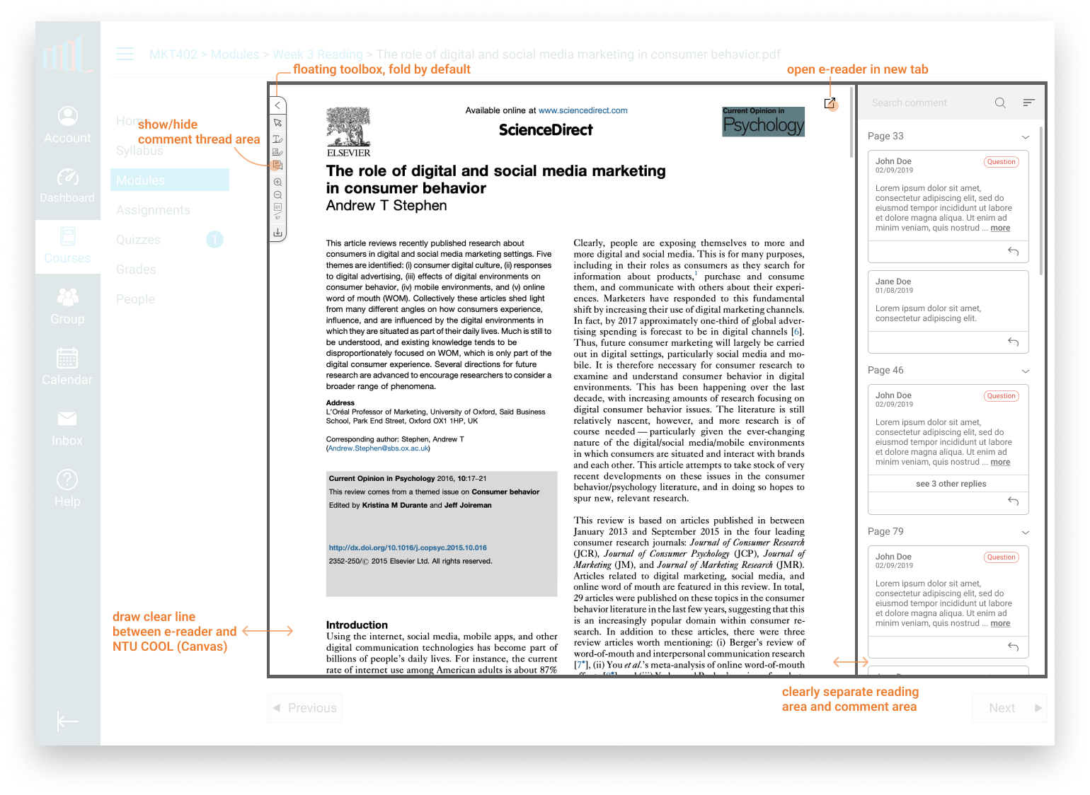
Unnecessary part is abandoned and less important tools are stored in a single button to maximize the reading space. Also, the area of Canvas, content, and comment thread are clearly defined so that users know which part they are controlling and have flexibility to customize the interface.
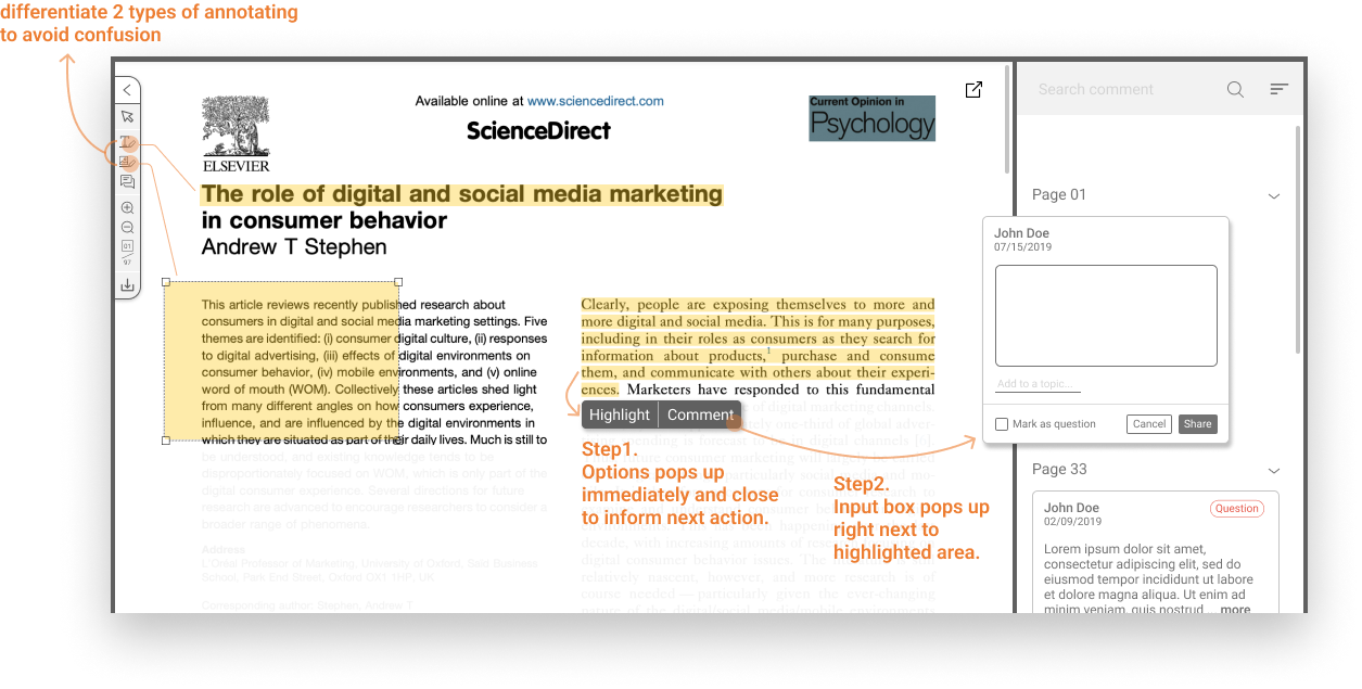
Distinguish similar but different annotating features to reduce vagueness and give users obvious hint to help them annotate on the fly.
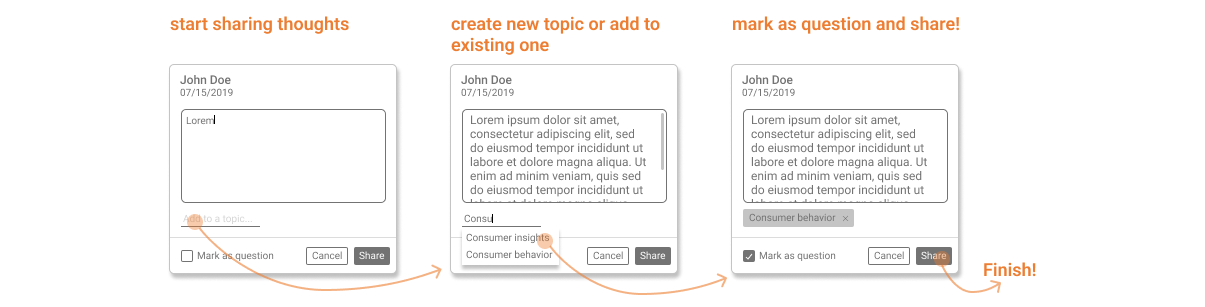
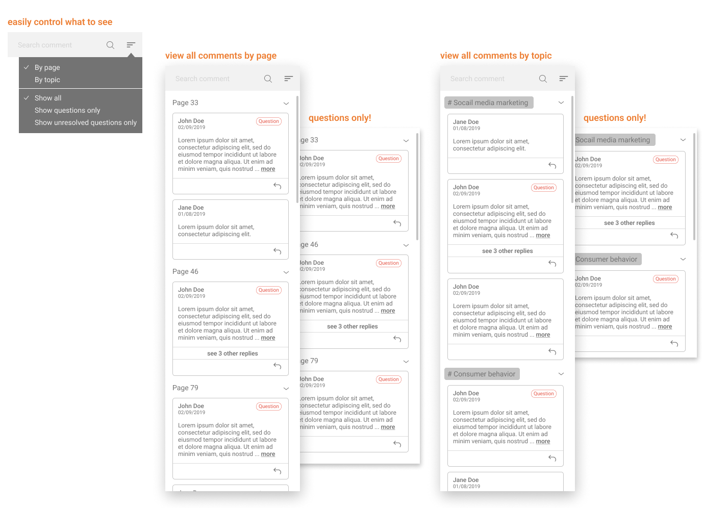
Not only make all comments searchable but also organized by different dimensions, teachers can easily view all unresolved questions and students can discuss with their peers by referring to certain page or topics.
Even with limited resources, there are still a lot of things I can try to do to make a product better.
All the instructors invited to interviews were already decided before I joined this project, if there was a second chance, I will improve the screening process and recruit interviewees with diverse attributes, i.e. class type, class size, and teaching style etc. to have a more thorough understanding of different scenarios and use cases. Moreover, to have students, TAs involved in the research can make the picture more complete.
After we had the refined design question, we should do some rounds of ideation to focus on “how to improve the interaction between instructors and students” itself, rather than quickly jump in to the decision of designing better interaction tools for video platform and e-reader.